Whether you use online booking at a hair salon, fitness studio, or massage therapy spa, you know the thrill of when a new client booked an appointment online.
Online scheduling software is a beautiful thing.
There are no phone calls to return, fewer mishaps (re: double booking), and of course, those automatic appointment reminders via text. ✨
But maybe the best feeling?
When someone “just finds you” online — no word-of-mouth or Instagram hashtag strategy required.
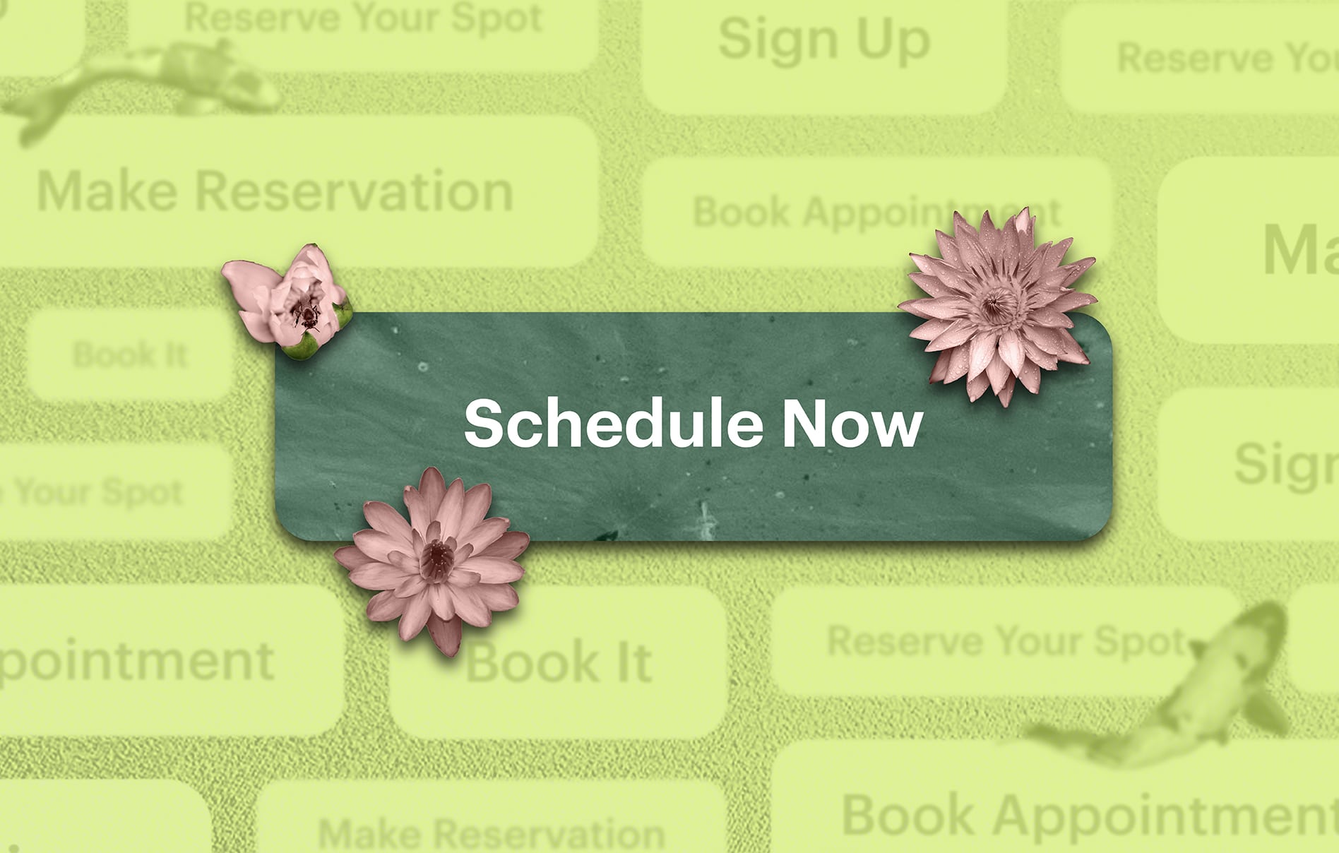
In most cases, those totally new clients book through what digital marketers refer to as a call-to-action or CTA.
You see them everywhere, and you use them whether you’ve heard of a “CTA” before or not.
Call-to-action examples include:
- Book Now buttons on salons’ Instagrams
- Pop-up banners for advertise holiday sales
- Form fills on websites to sign up for a newsletter
But just because they’re everywhere doesn’t mean you’re using them to their full potential.
A CTA done right can double or triple your new client sign-ups, package purchases, or studio memberships.
That’s why we’re breaking down the easiest way to get new clients: a killer CTA.
We’re sharing handy call-to-action words and examples that will make someone who’s totally unfamiliar with your business want to book an appointment with you ASAP.
In this article:
- How to Write CTAs That Customers Love
- Examples of Bad and Good CTAs
- How to Add Book Buttons to Social Media (with Schedulicity)
- How to Add Book Buttons to Your Site (with Schedulicity)
How to Write CTAs + Banners That Customers Love
Make the Words Time- and Cost-Sensitive
The best CTAs make someone want to book an appointment or class (or purchase a product) right now.
That means they should include clear language that tells someone these deals will not last forever.
One of the main reasons “Book Now” buttons work is because the word now feels urgent.
The same goes for “limited time” offers, “one-time only” sales, and “flash deals”.
The less time someone has to hesitate, the more likely they’ll be to jump in.
Speak Directly to Your Clients
When writing calls-to-action, always use active voice. Present tense is the best.
It gives your buttons authority and urgency, and active voice feels less formal — like you’re talking directly to a new client before they book.
As a rule, we typically prefer copy that speaks directly to us. It’s more personal and makes us feel like we’re seen.
Also, you want to make sure the CTAs clearly describe what the person is supposed to do next.
Think about buttons like JOIN NOW or SIGN UP versus CLICK HERE.
Urgent and active vs passive/lazy.
Don’t Be Afraid to Get Creative
Get playful or clever with your CTAs, especially if they include a custom discount code.
After all, your hair salon or yoga studio isn’t boring, right?
Pro Tip: Schedulicity has a Deal Manager tool for both class- and service-based businesses. You can customize a deal or discount to share directly with clients via email or social media.
Use Only One CTA at a Time
This is just a fact: If you include more than one CTA in an email or on a site page, you get fewer clicks.
Why? You’re splitting your audience.
That’s fine in a newsletter where you want people to click on your blog or to explore your services, but if the goal is to get clients booking appointments ASAP, keep it simple.
Make the CTA or Book Now button the biggest, boldest, and (ideally) only option they see. It’s the easiest way to get more clients faster.
Partner (or Bundle) Up
Most CTAs are pretty straightforward. You offer a site visitor one link and hope they take the action you want.
Like our last tip, you want to keep things simple because those are the most effective CTAs. That said, there’s power in the art of the upsell.
Have you ever received a cart abandonment email from a brand after you left something in there?
Or bought something extra after seeing things “Similar customers also bought”?
That’s an upsell, and you can do it, too, with your CTAs.
Let’s say you’re a stylist, and you allow clients to book online for your hair salon.
Why not offer them their favorite hair products while they’re scheduling an appointment? You can have the goodies waiting for them when they arrive.
Same goes with class management.
Once someone books a class, consider offering them a discount if they purchase a package instead.
(You can do all of this with Schedulicity’s customizable package management and our built-in payment processor.)
The main takeaway: Once you got their attention with a brilliant CTA, you can still get creative with how you finish the process to make more money per transaction.

Social Media Marketing 101
Deep-dive into trends, tools, and hashtags that will take your brand – and small business – to the next level.
Get the GuideExamples of Good and Bad CTAs
Now that we established best practices for writing great calls-to-action, let’s talk through the good, the bad, and the ugly.
Take these two examples — which sounds more urgent to you?
Option A:
Until 12/27/19 at 12AM ET, try a monthly membership for only $150. [REGISTER HERE]
Option B:
Only 23 hours left to get $50 off a monthly membership. Use the code NOWORNEVER at checkout. [BUY NOW]
If you prefer Option A, we’re not judging — but the truth is that most people wouldn’t.
If the goal is to get the most people to sign up for a membership, go with Option B. Why?
- “Only 23 hours left” or any “only X amount of time left” gives you FOMO. It implies that if you don’t book now, you’re going to miss out.
- $50 off makes it clear how much money they’d save. In Option A, you assume someone knows how much a monthly membership costs — but why would they? Instead, they look at the copy and think “$150 is pretty expensive.” Not if it normally costs them $200 — that’s a 25% discount, which is a steal. Use the language that makes the offer look best.
- Option B is also playful with a custom discount code that ups the urgency even more.
- A button that says [BUY NOW] is a lot stronger than [Register Here]. In fact, get rid of [Here] from any of your buttons. It’s superfluous.
How to Use CTAs and Book Buttons on Social Media
Adding buttons to social media is a snap as long as you have a scheduling software, such as Schedulicity.
Here’s a quick explainer, then we’ll dive into adding Book buttons and CTAs to your website as well.
How to Add a Book Now Button to Instagram
If you’re ready to add a Book button to Instagram for your hair salon or fitness studio, all you need is a Schedulicity account. We’ve built one right in. Here’s how to add a book now button to Instagram now and start getting new clients right away.
How to Add a Book Now Button to Facebook
Facebook makes it really simple to add a Book Now CTA right to the top of your business page. Head to your Facebook business page. Just below the cover photo, press the “Add Button” to get started.
How to Add a Book Now Button to Your Website with Schedulicity
If you’re a Schedulicity user, we made it easy for you to offer appointment scheduling through your own website (because fewer steps to booking is a better customer experience!).
Here’s how to allow people to book appointments with you directly through your website:
- Login to your Schedulicity account.
- Head to the Marketing section of your account, then click on the Widget tile.
- You can choose from two types of CTAs (or use both!):
- Book Now button: Choose the size and style of button you want to put on your site. This button will bring clients from your site to your booking page on Schedulicity.
- Scheduling widget: Add the booking process right into your website. It’ll be a section built into the page (called an Embedded scheduling widget) or a CTA that hovers on the right edge of the page and triggers a pop-up booking screen (called an Overlay scheduling widget).
- After picking the widget you want to use, copy the code generated below, and paste it into the body section of your website.
See examples of both here.
Need more help getting clients to book with you? Or want to get started with our online scheduling app?
The Schedulicity support team is here to help with more tips.
P.S. Schedulicity also integrates with Reserve with Google, so that millions of Google users can better discover your business on Google Search and Maps, and then easily be redirected to your Schedulicity site to make an appointment with you.
It’s another business-building CTA that doesn’t cost you a dime. 👇


